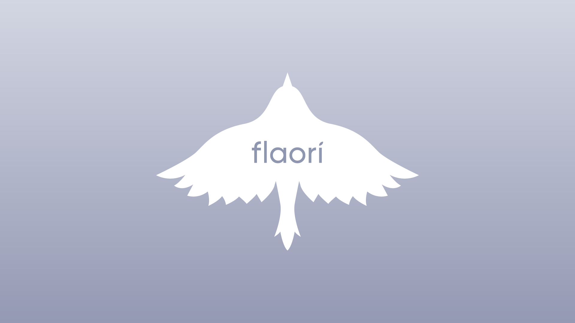
The Flaori project focused on creating a visual identity for a tea brand that celebrates the natural richness and diverse flavors of its products. The work included designing a logo that reflects the brand’s elegance and lightness, as well as packaging concepts for various formats.
Flaori
Logo, Package Design
2024
Production
Just florish!
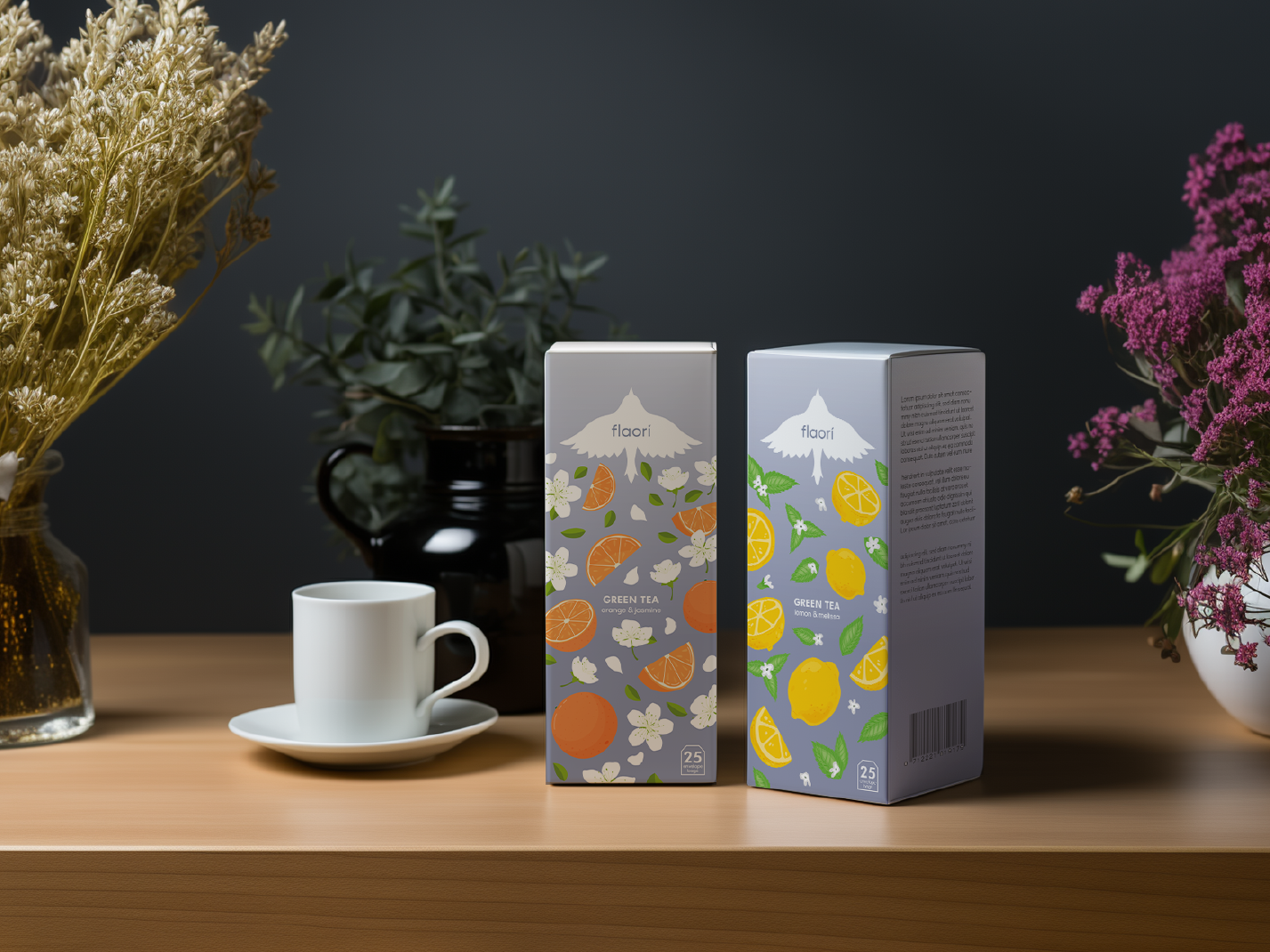
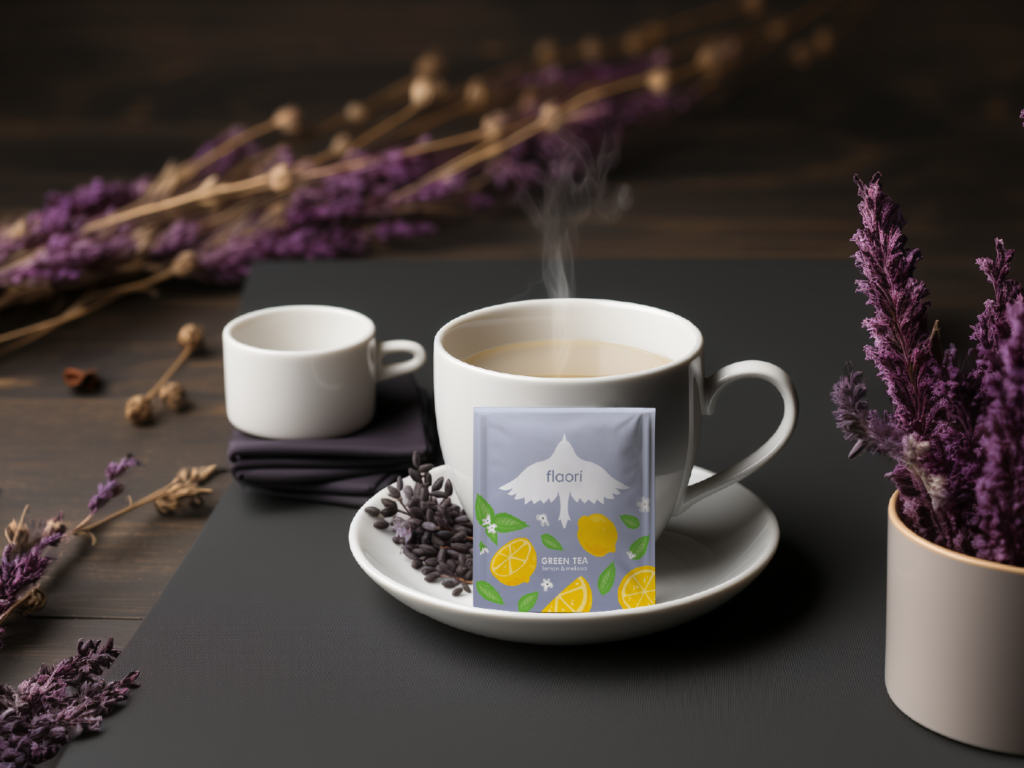
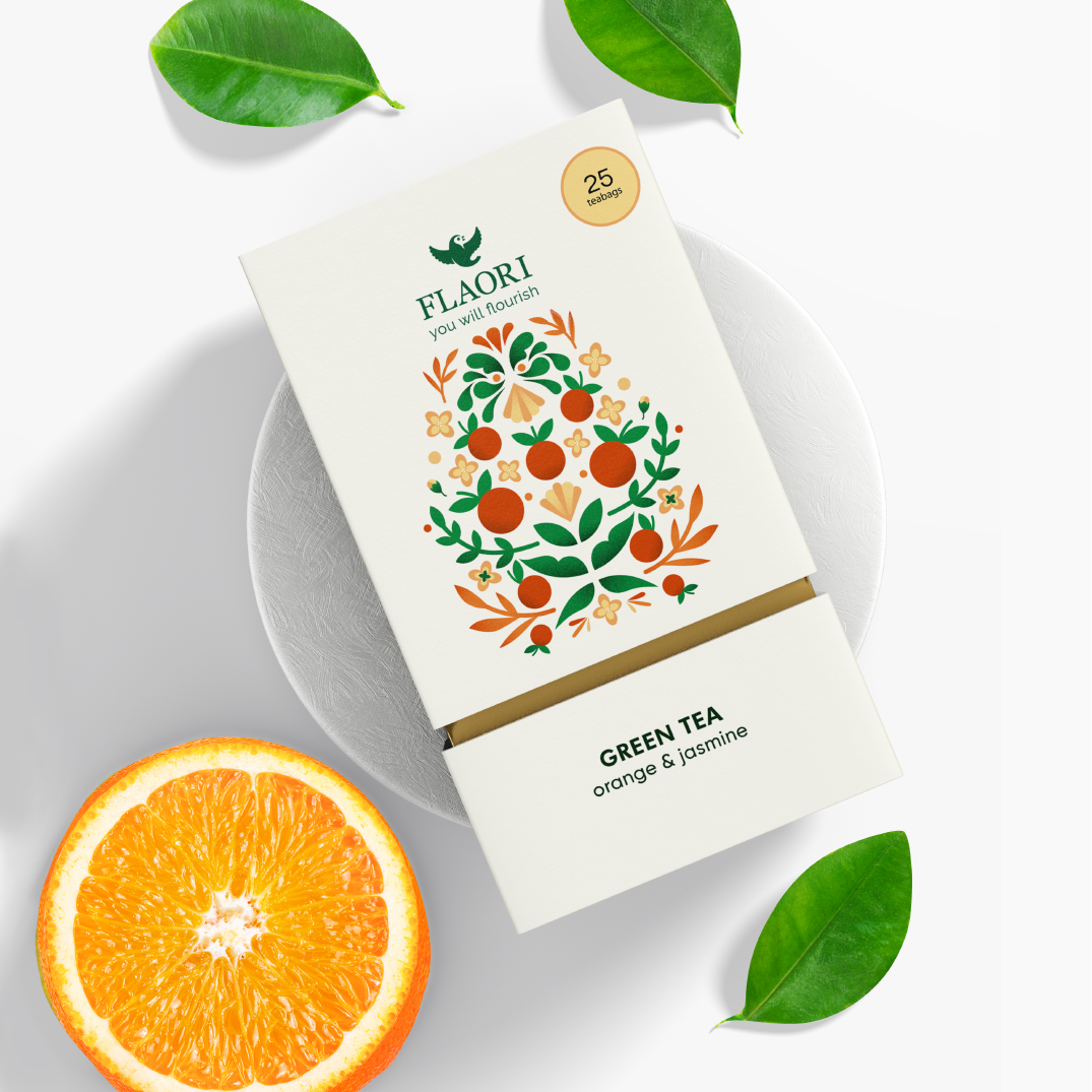
The project included a full packaging design cycle: from creating illustrations and vibrant visual elements to layout design and preparing print-ready mockups. The result is a memorable packaging that effectively grabs attention and stands out on the shelf.
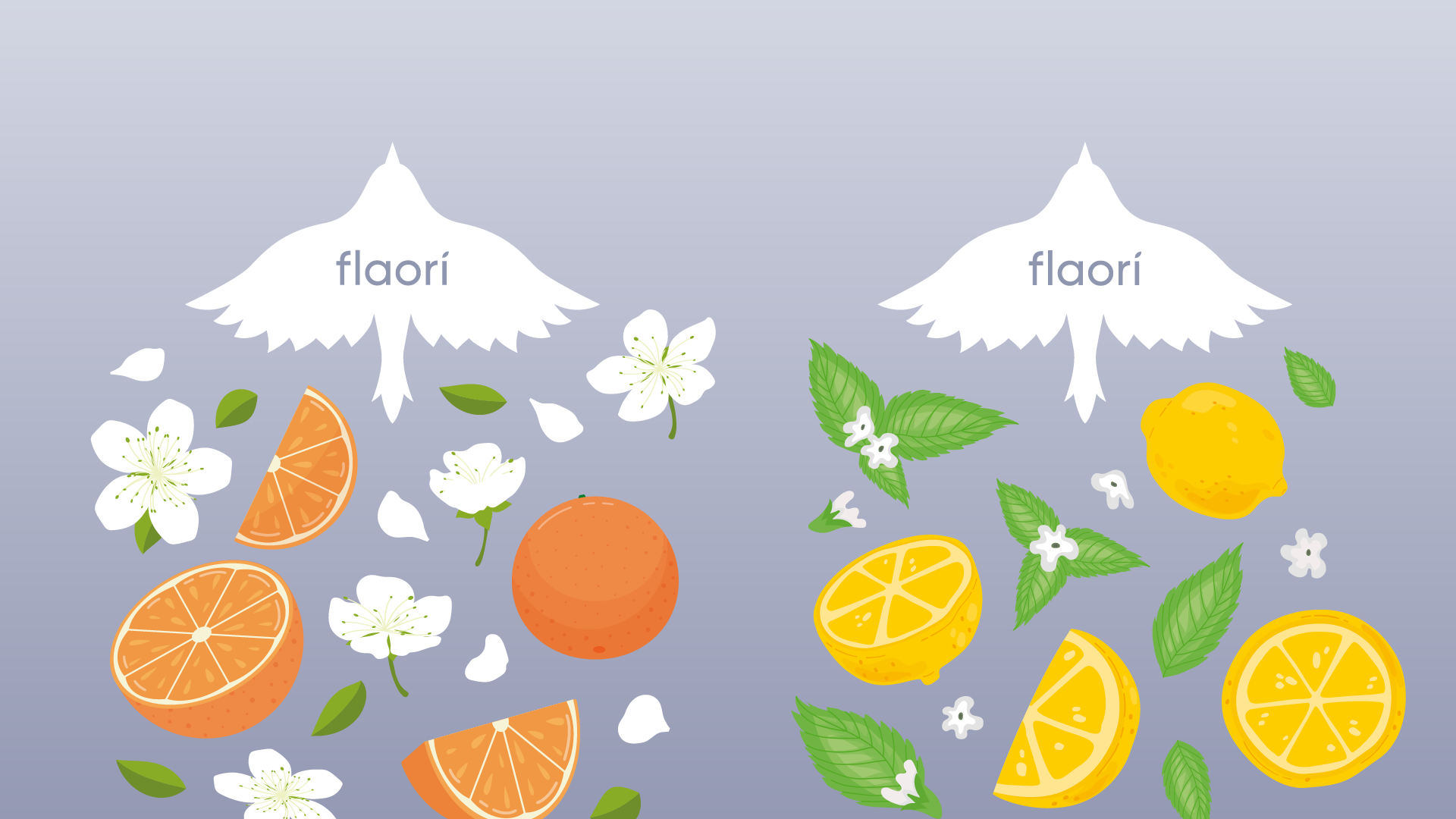
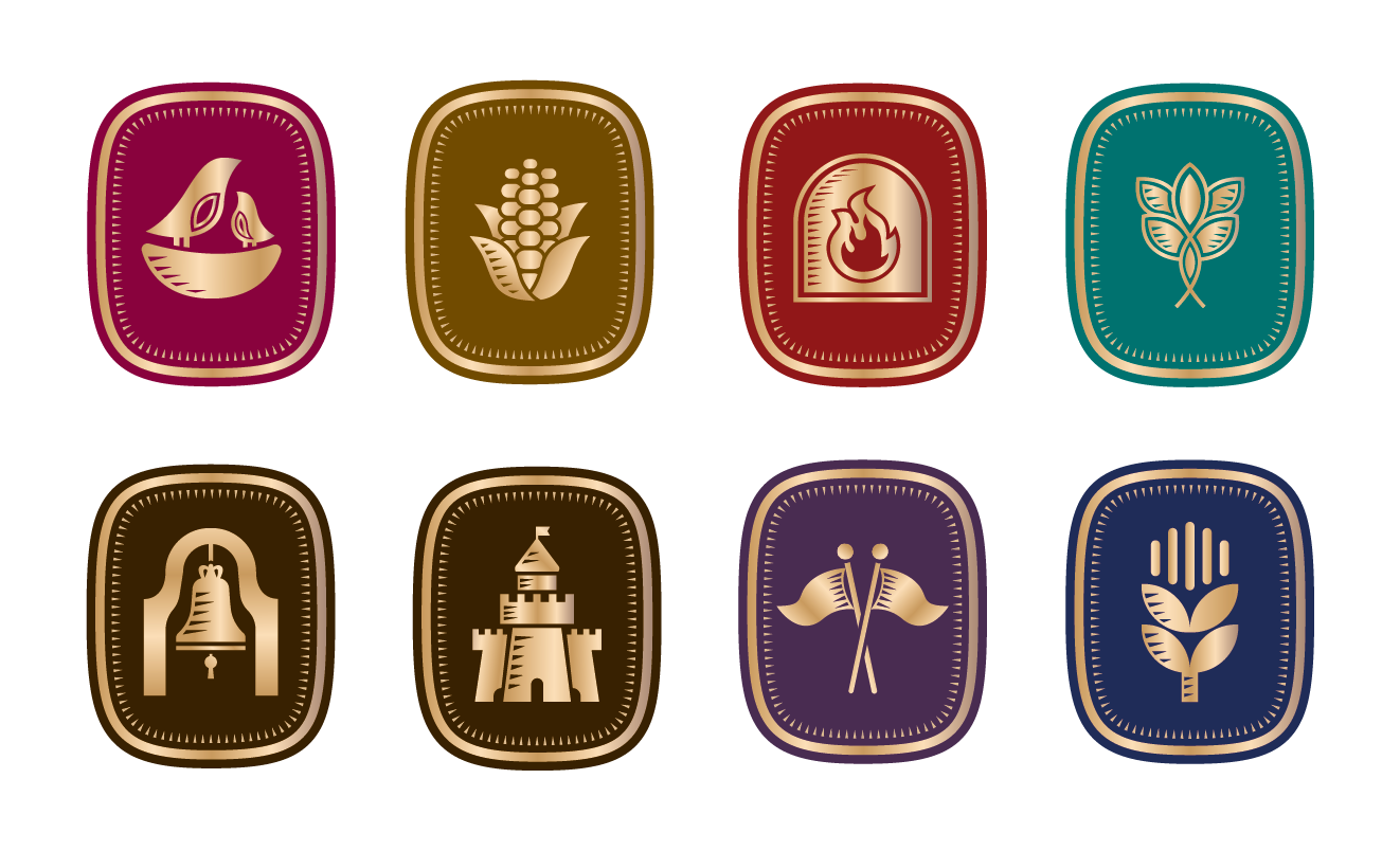
Illustration
Flaori
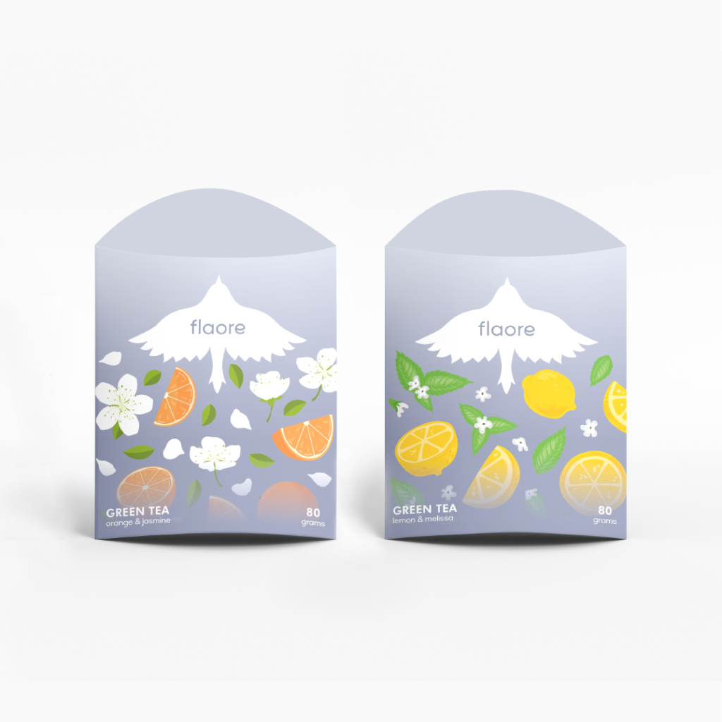
The packaging illustration features a flying bird, symbolising the tea’s refreshing flavours: lemon and melissa, orange and jasmine. Designed in a clean, minimalist vector style, it subtly reflects the essence of each tea’s taste.
A variety of packaging designs highlight the unique characteristics of each tea flavour. Clean, minimalist visuals combined with thoughtful illustrations ensure the packaging is both functional and appealing, reflecting the essence of the tea inside.