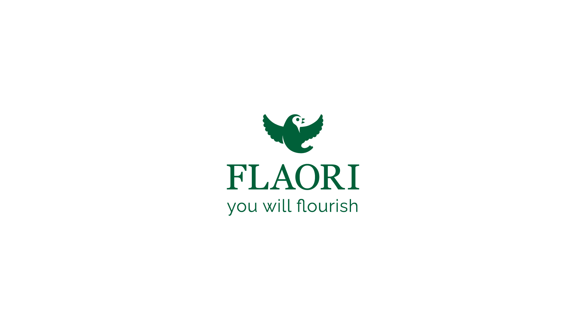
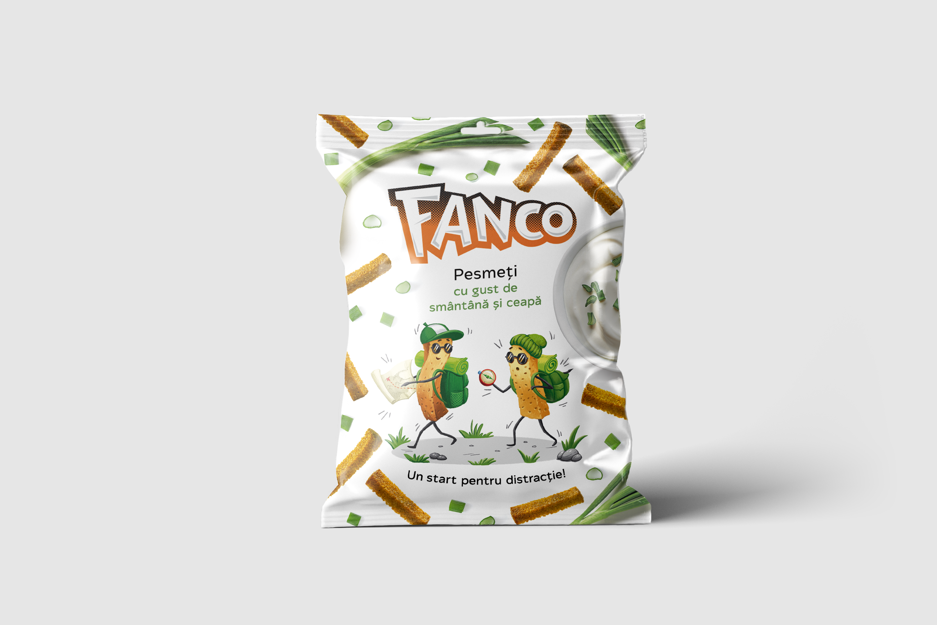
The Flaori project focused on creating a visual identity for a tea brand that celebrates the natural richness and diverse flavors of its products. The work included designing a logo that reflects the brand’s elegance and lightness, as well as packaging concepts for various formats.
Flaori
Logo, Package Design
2024
Production
Just florish!
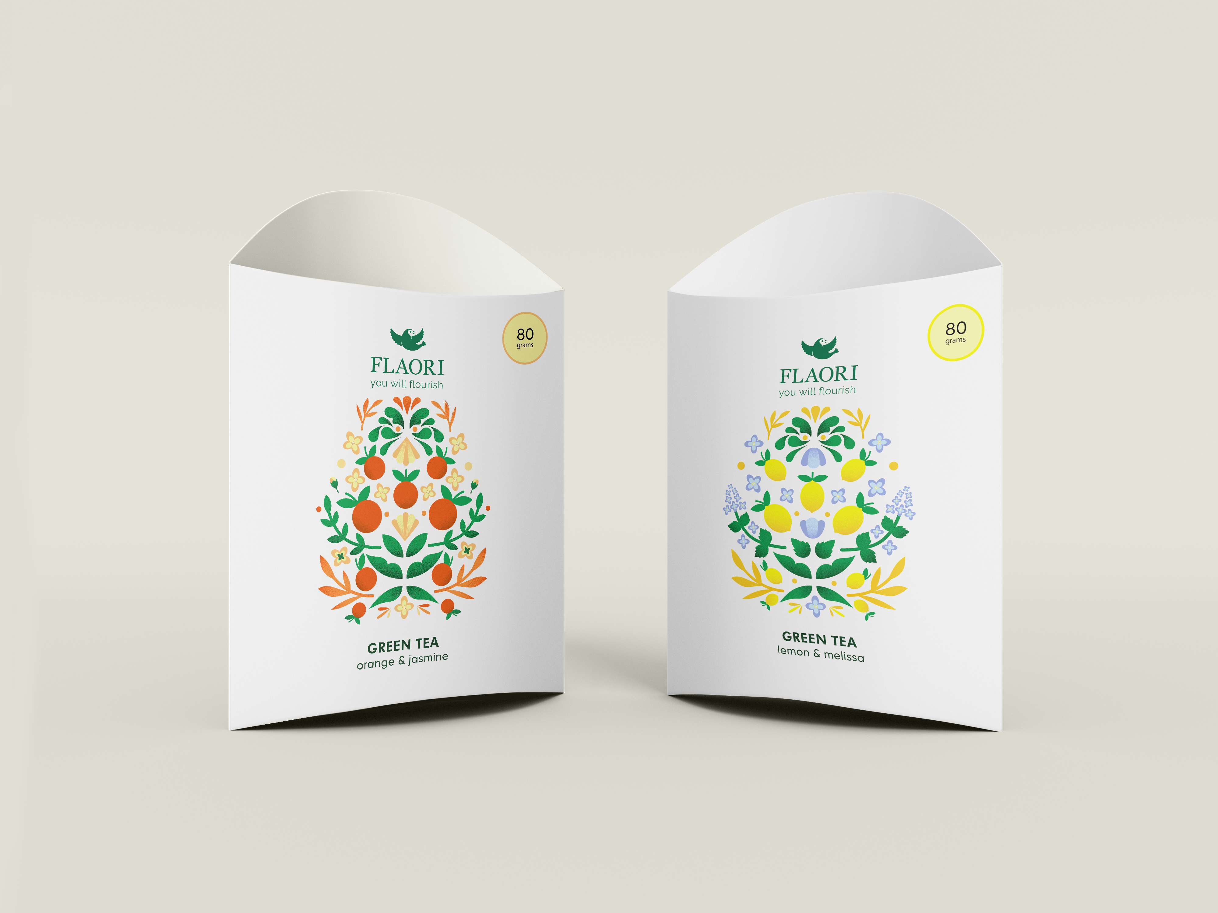
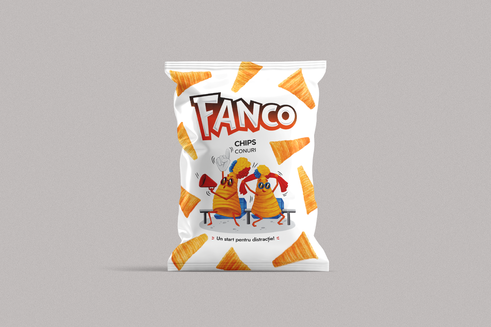
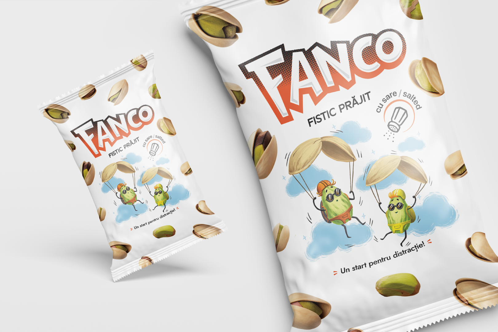
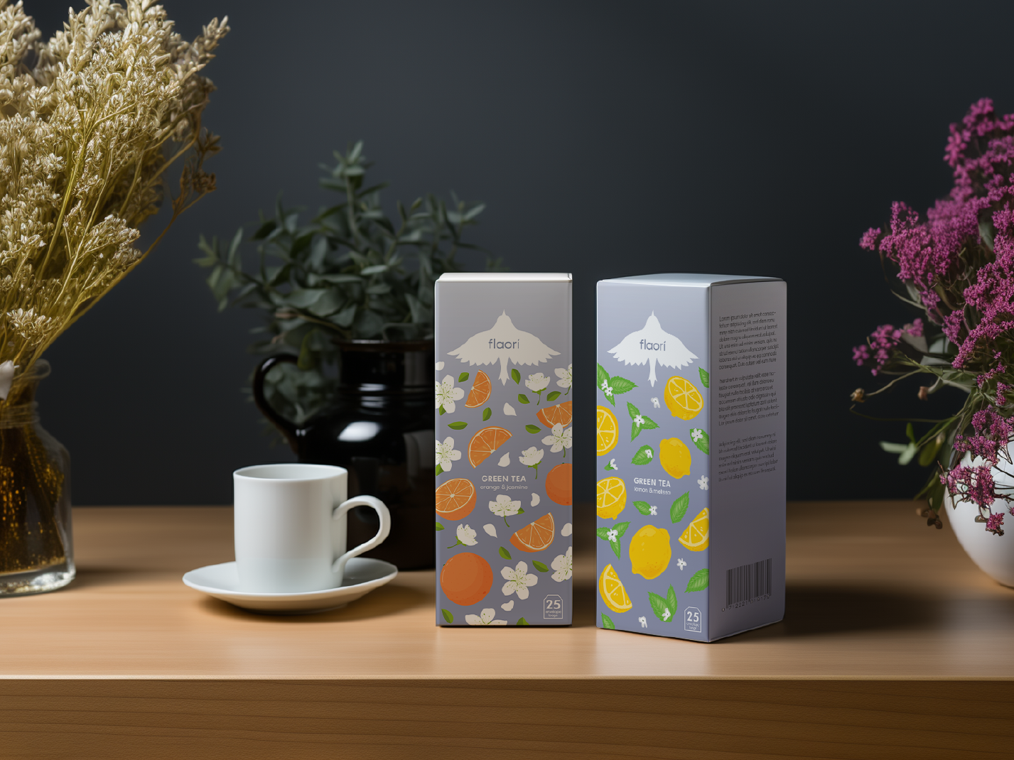
The project included a full packaging design cycle: from creating illustrations and vibrant visual elements to layout design and preparing print-ready mockups. The result is a memorable packaging that effectively grabs attention and stands out on the shelf.
Illustration
Flaori
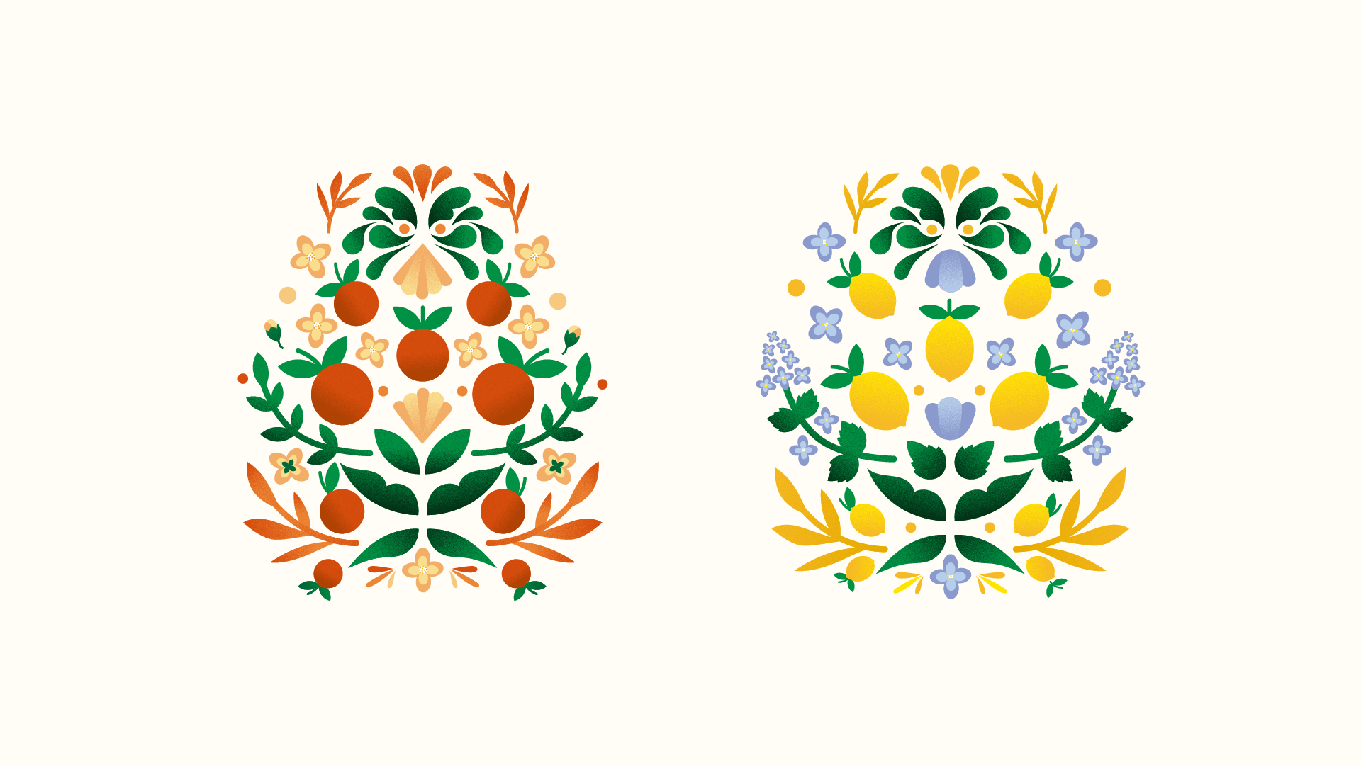
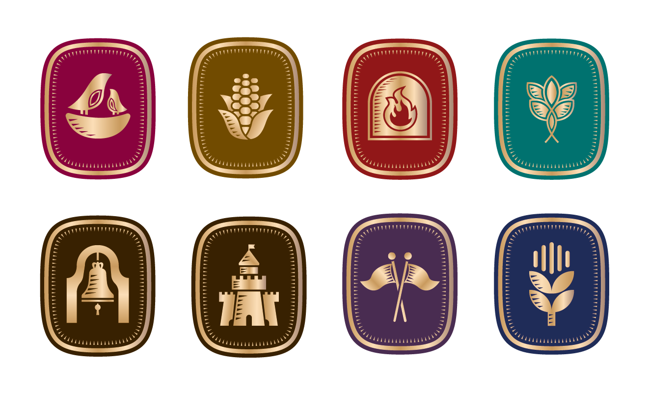
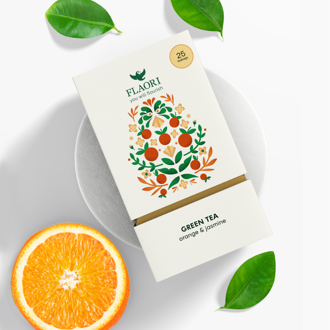
The illustration on the packaging is a modern take on heraldic design, uniquely tailored to represent each tea flavor. Elements like lemon and melissa or orange and jasmine are seamlessly incorporated into the heraldic motif, highlighting the tea’s natural ingredients. Crafted in a minimalist vector style with subtle textures, the illustration adds depth and sophistication to the design while maintaining a clean and elegant aesthetic.
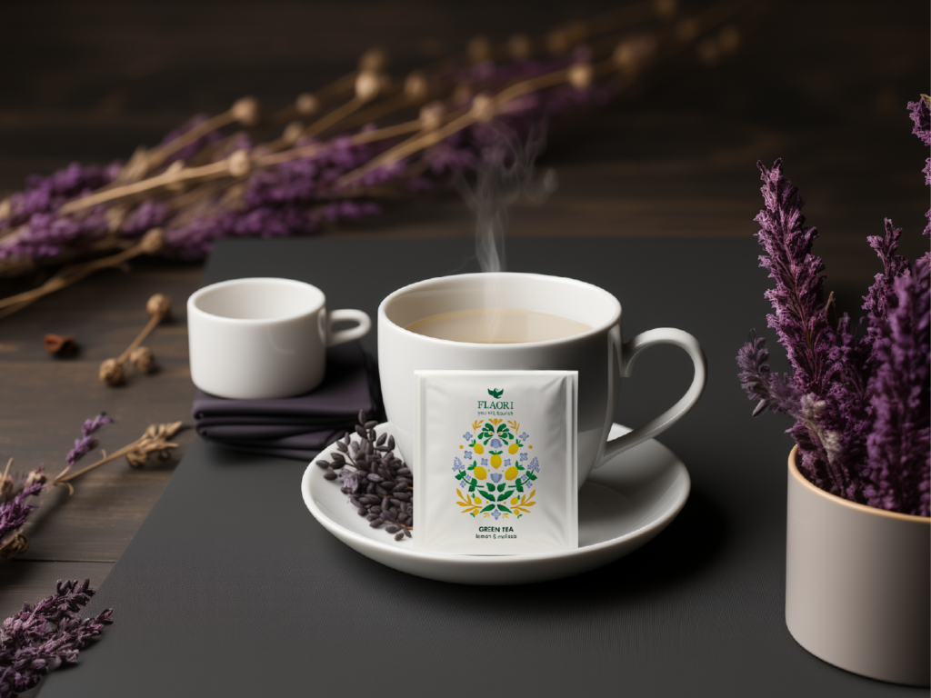
Flaori packaging is thoughtfully created to adapt to different formats, ensuring a clean and cohesive design that effectively highlights the unique flavors of each tea.