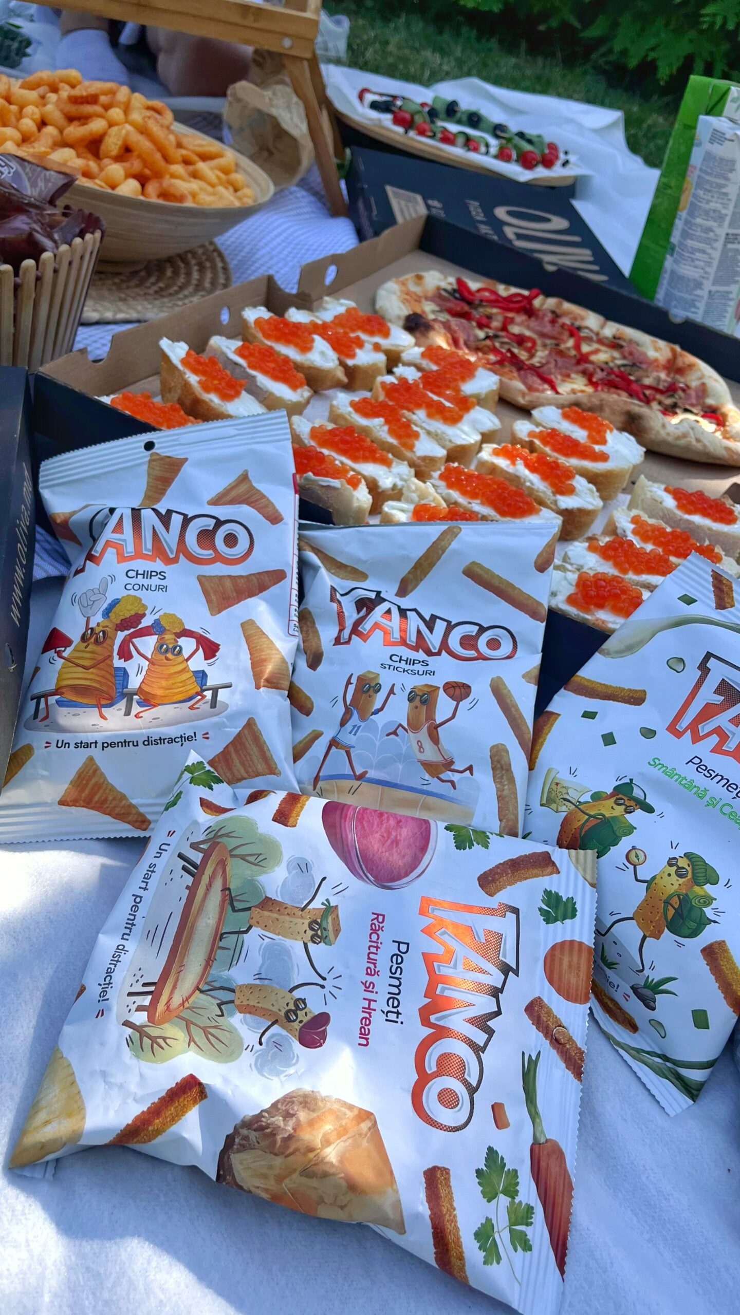
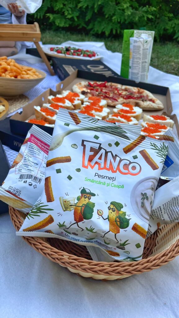
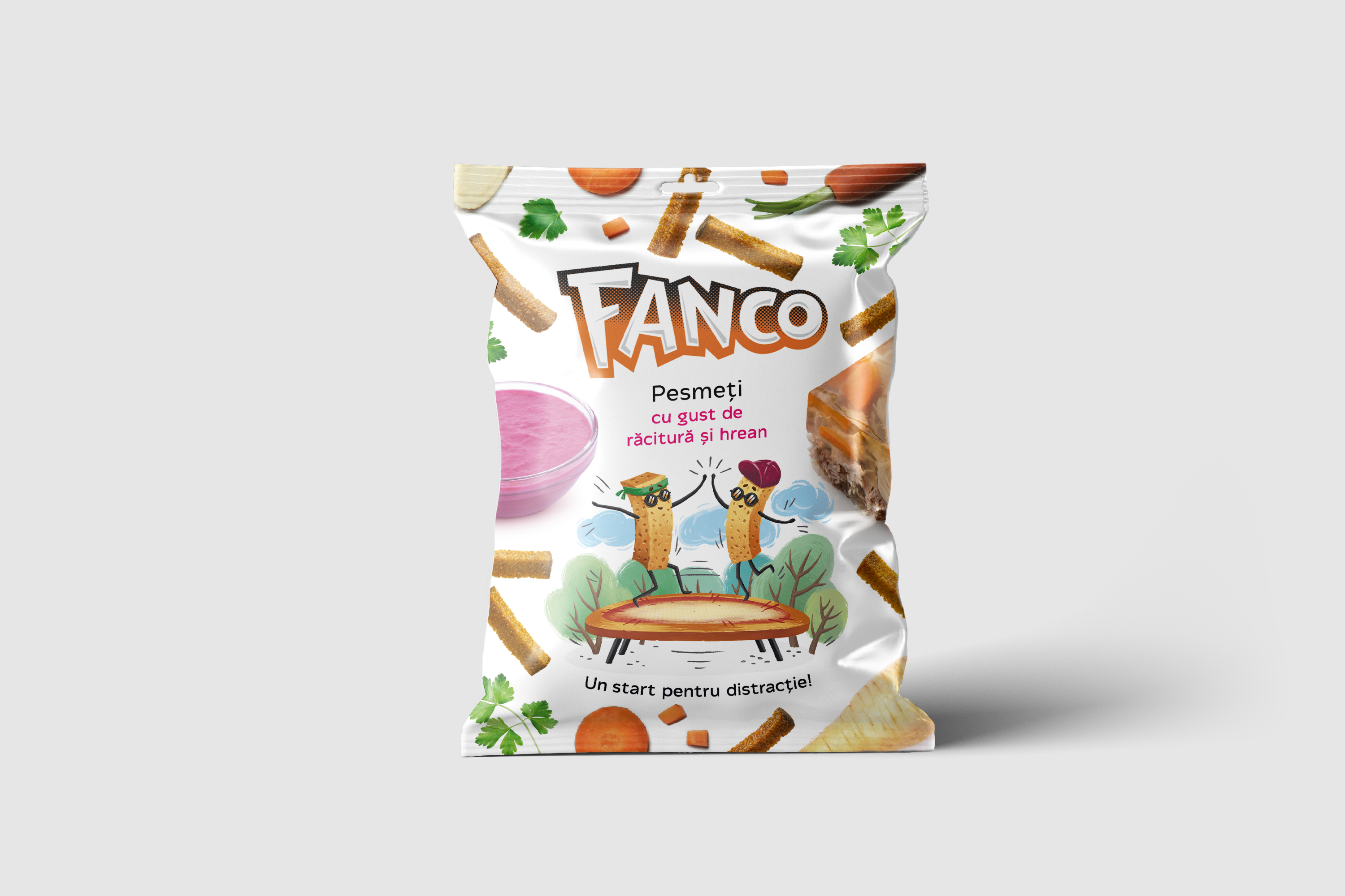
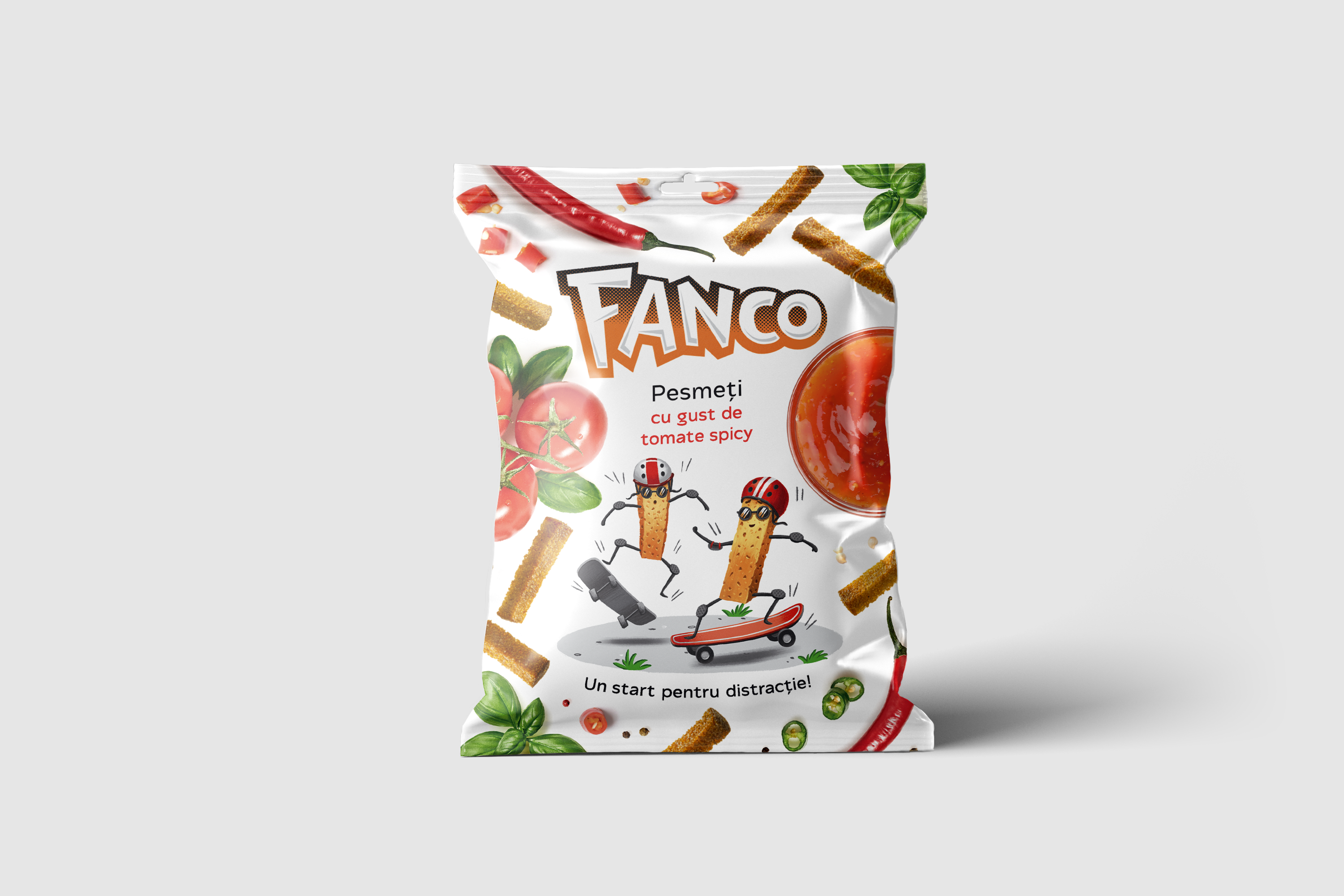
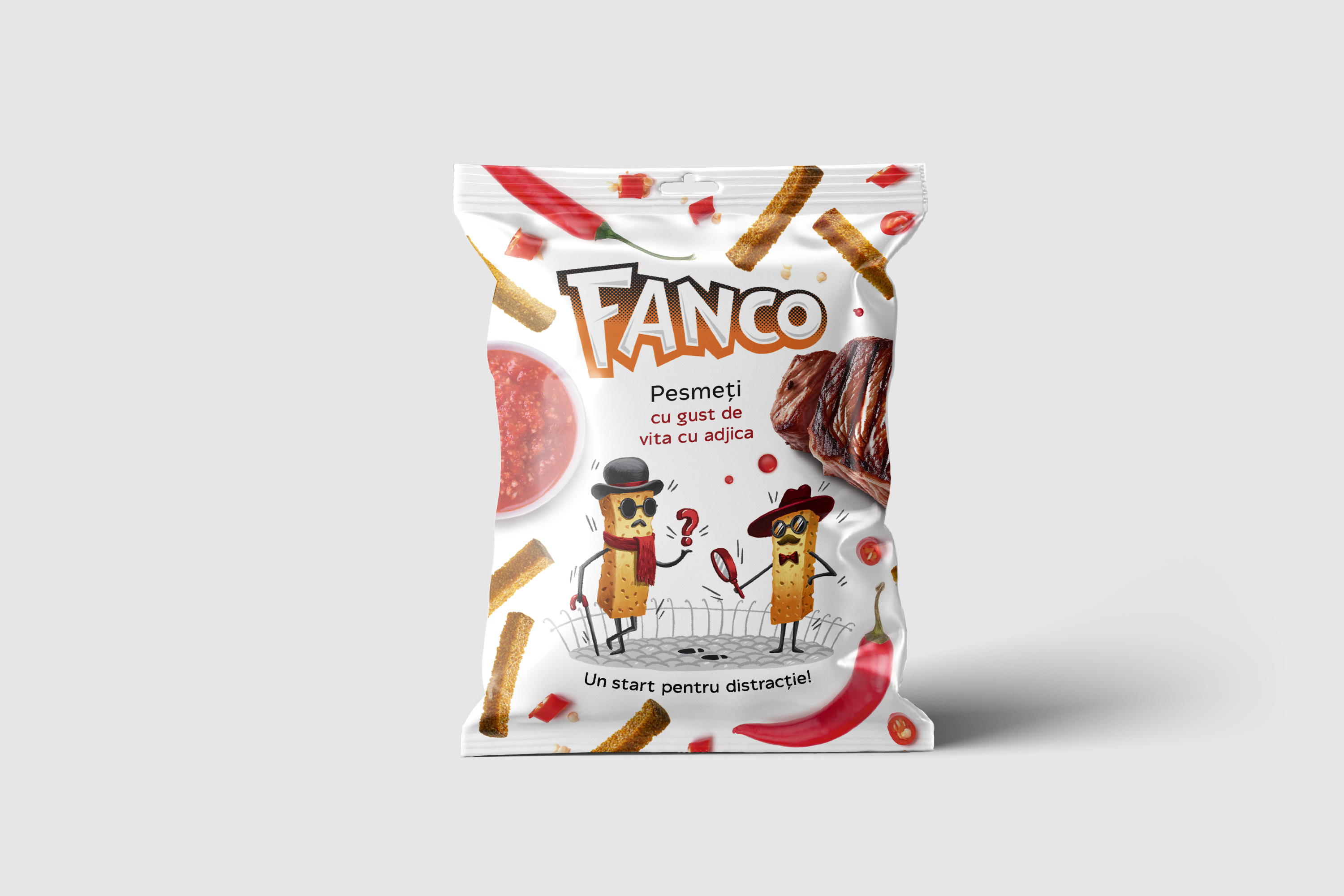
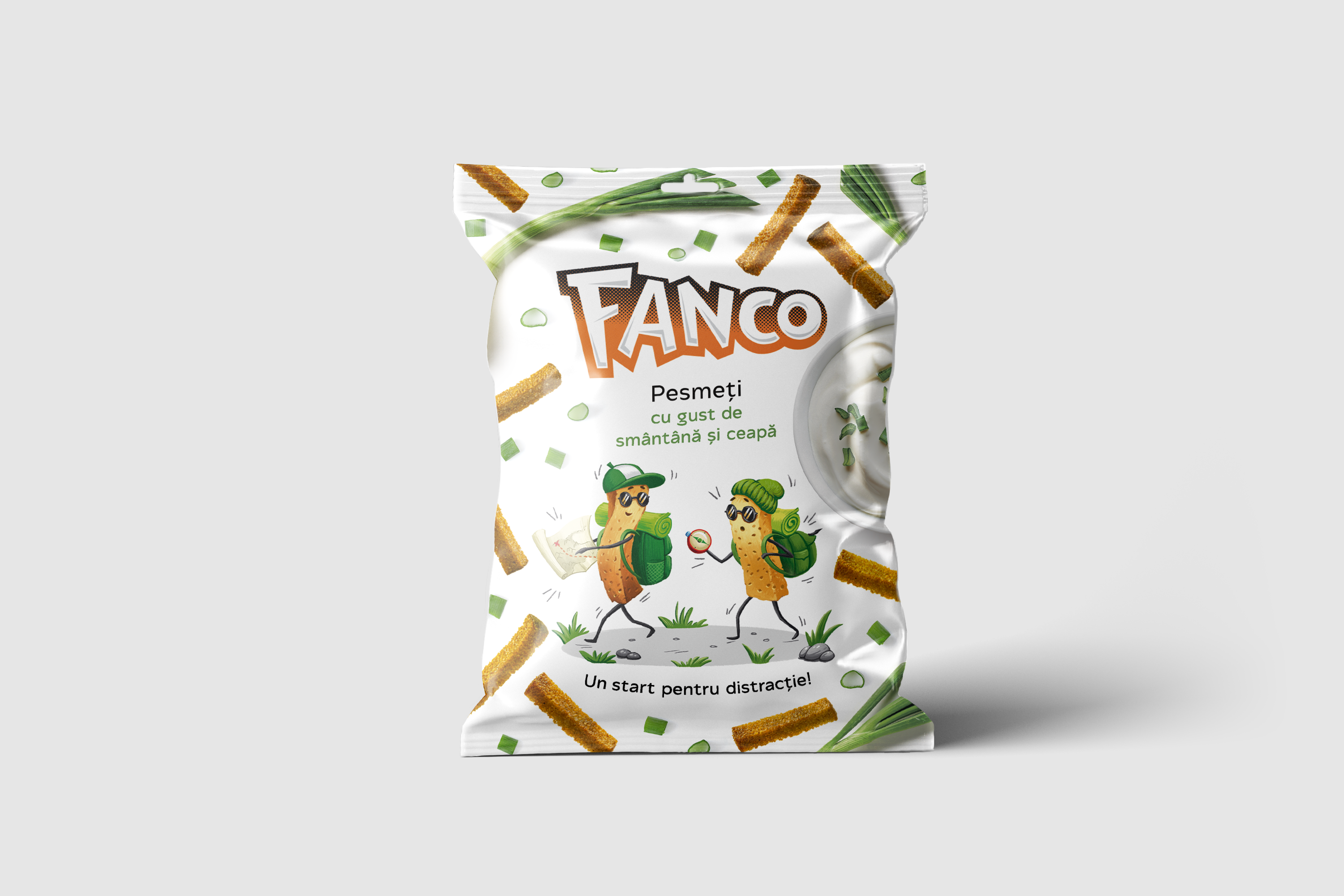
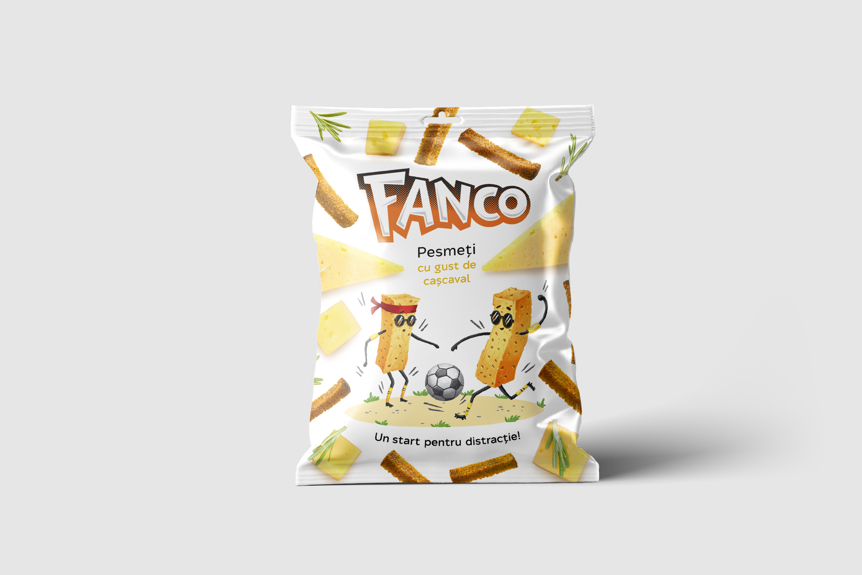
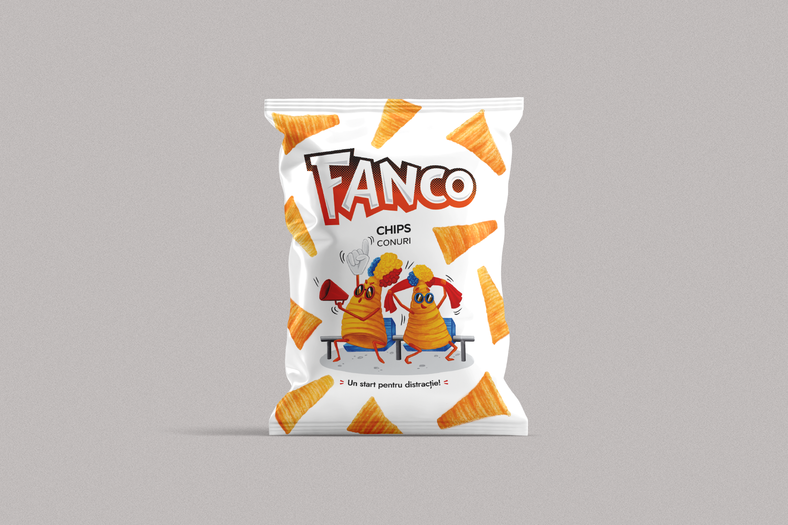
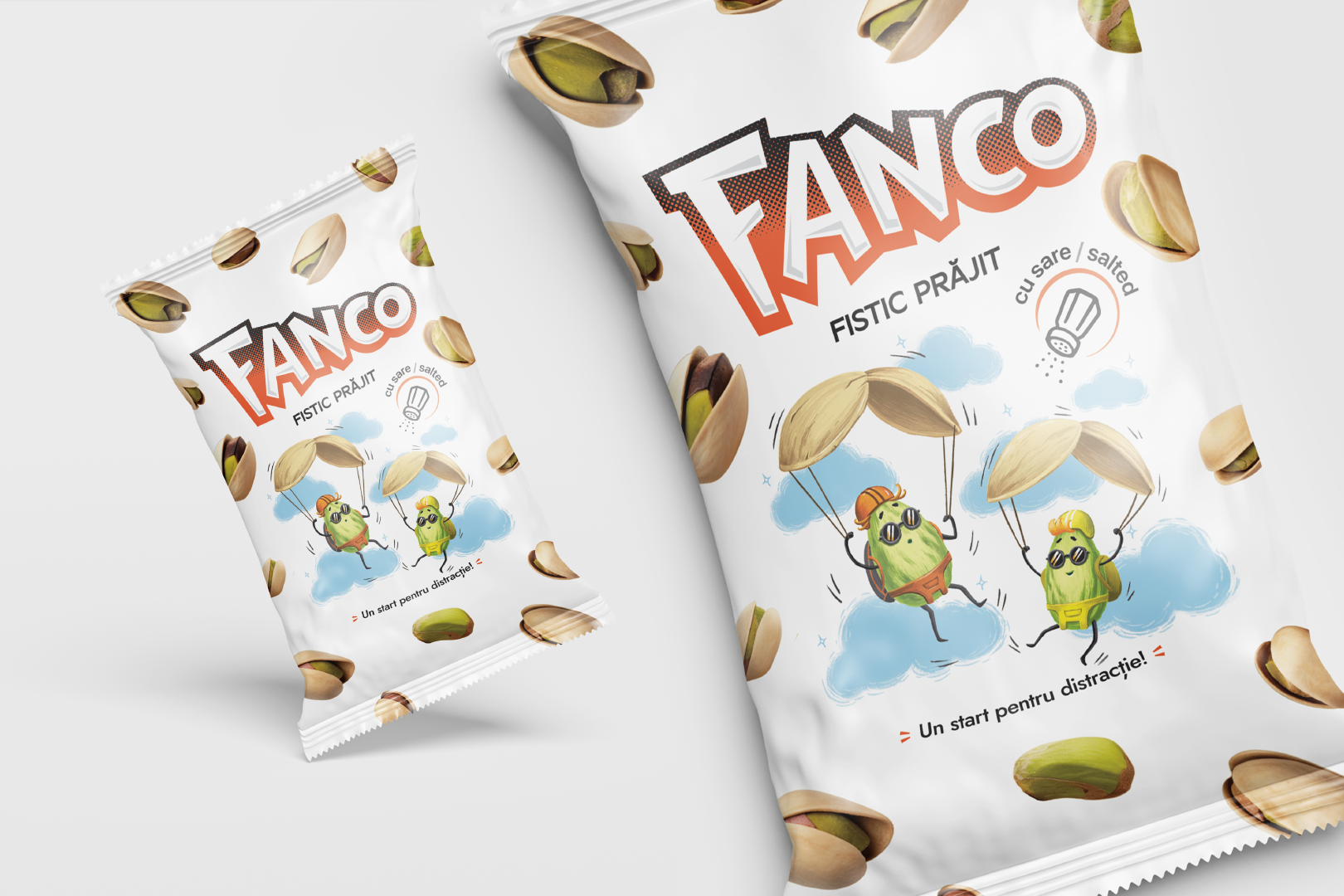
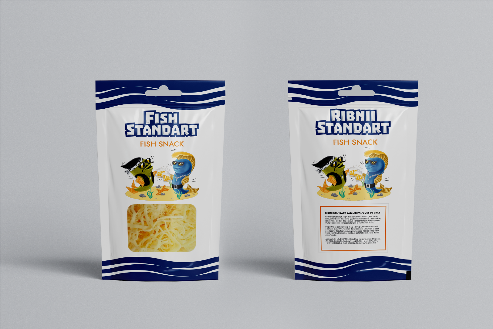
Fanco (croutons) is a project dedicated to creating packaging for various crouton flavors. Unique illustrations were developed for each flavor, highlighting the distinctive characteristics and taste of the product.
Fanco
Illustrations, Package Design
2024
Production
It's time to have fun!
The project included a full packaging design cycle: from creating illustrations and vibrant visual elements to layout design and preparing print-ready mockups. The result is a memorable packaging that effectively grabs attention and stands out on the shelf.
Illustration
Fanco
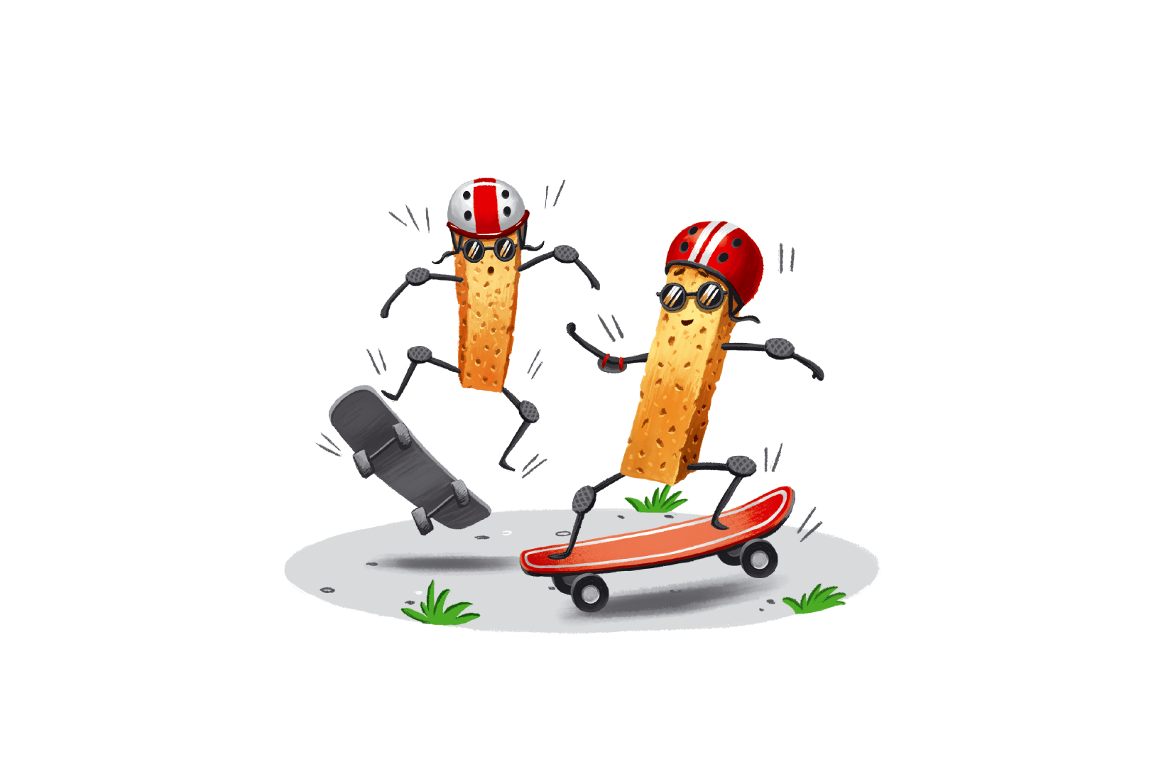
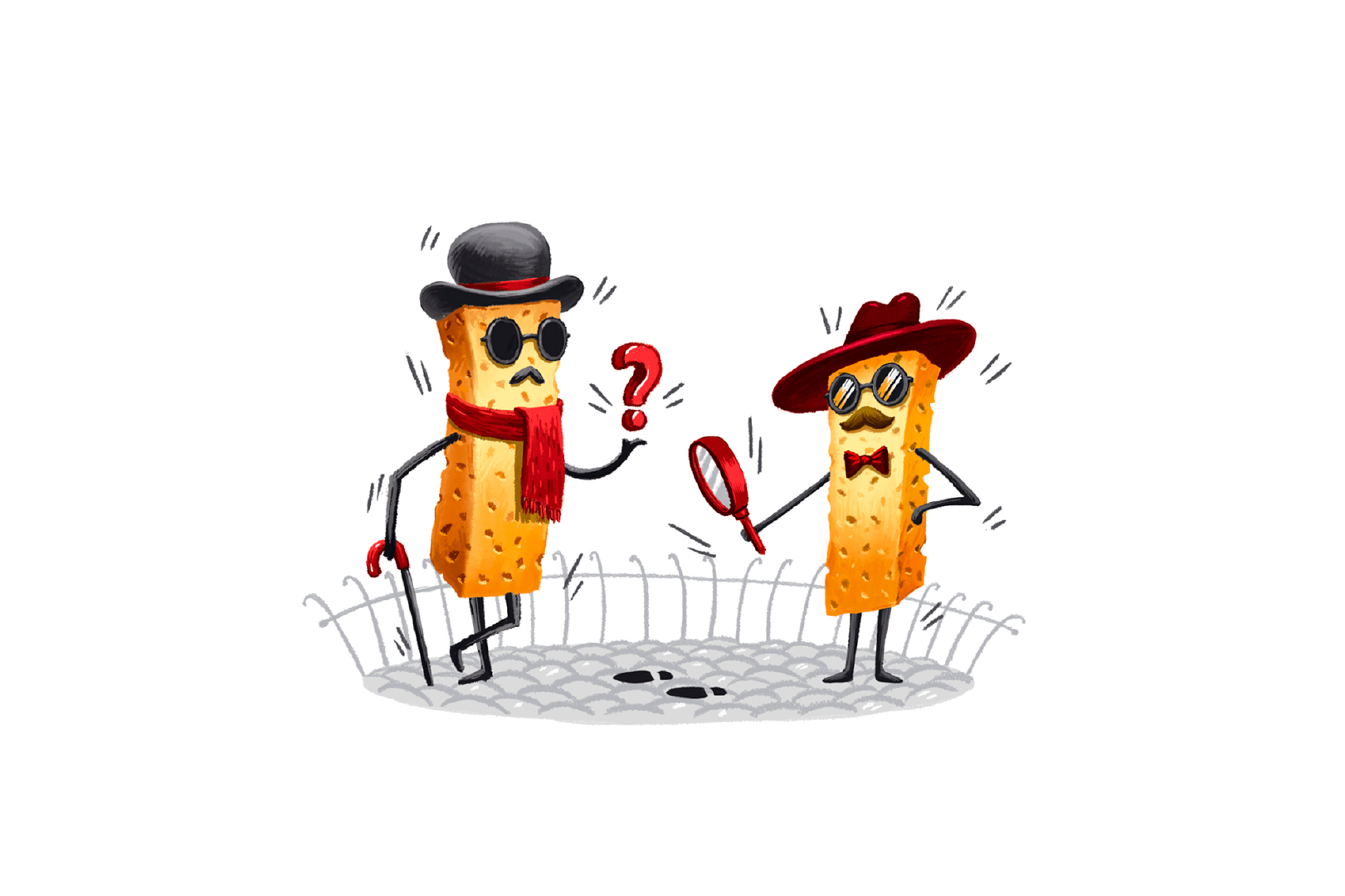
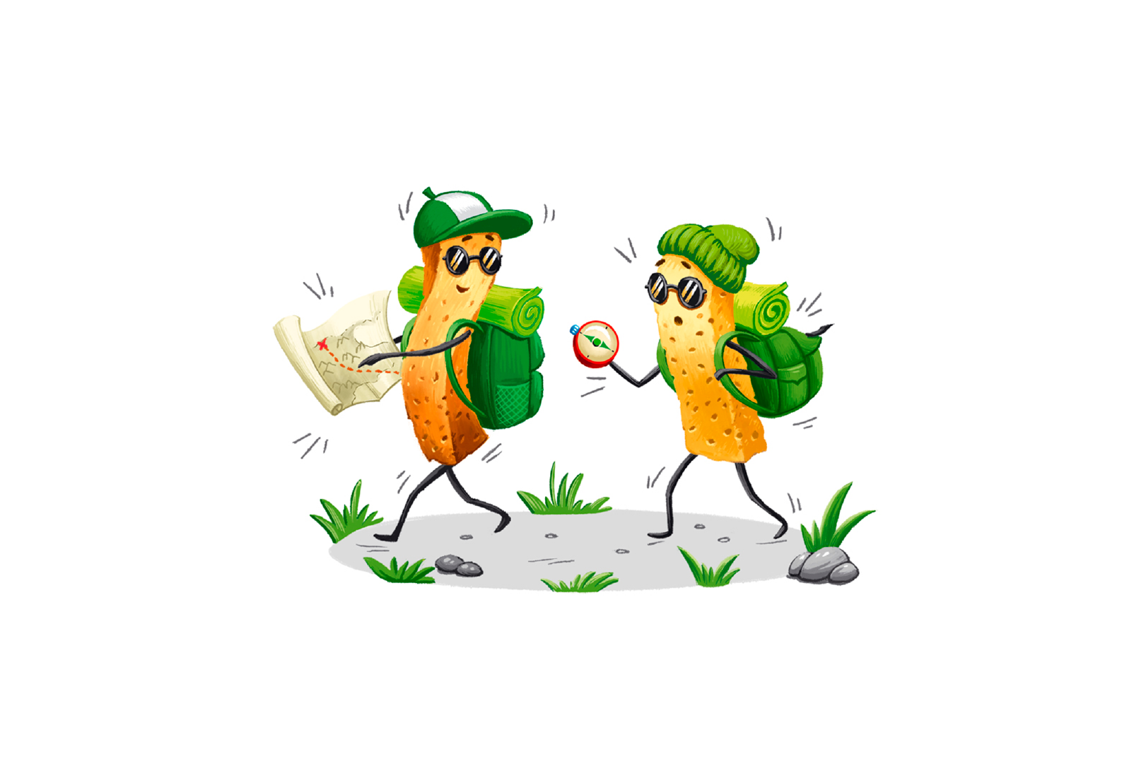
The illustrations for the Fanco (Croutons) project were designed with the “Regular Guy” archetype in mind, bringing a vibrant and memorable character to the packaging. Each illustration reflects a specific crouton flavour, visually highlighting its uniqueness.
The themes are closely linked to the brand’s slogan “A Start for Fun”. The characters — detectives, tourists, footballers, skateboarders and more – immerse the audience in a lively and adventurous atmosphere, emphasising the light-hearted and cheerful nature of the product. The illustrations focus on dynamic scenes and vivid details, enhancing their emotional connection with the audience and making the packaging both eye-catching and original.